YELP
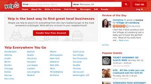
- Aimed to young adult and adult ( 18-34), people with high education ( college or higher) and have a high income
- The web can show you options about: restaurant, nightlfe,local service, delivery
- Has icons for different topics and different sections for different places – easy to navigate
- The main page looks blank and boring
- Has a mobile app
- Main colors: red, white
- Use sanserif font
Rome2rio

- Aimed to adult and young adult ( mainly adult) with averange or hight income
- nice picture background on the top
- colors: pink, black, white. Give a bright tone
- the website name is made by a script font with the pink dot on the i – looks unique
- Has a clear and dynamic design
- Plenty of different pictures for each place
- A lot of tags – easy to find the information you want
- Provides: transport, tickets, hotels, car hire
- Can change to different languages and currencies
- Nice user experince
Wanderlust
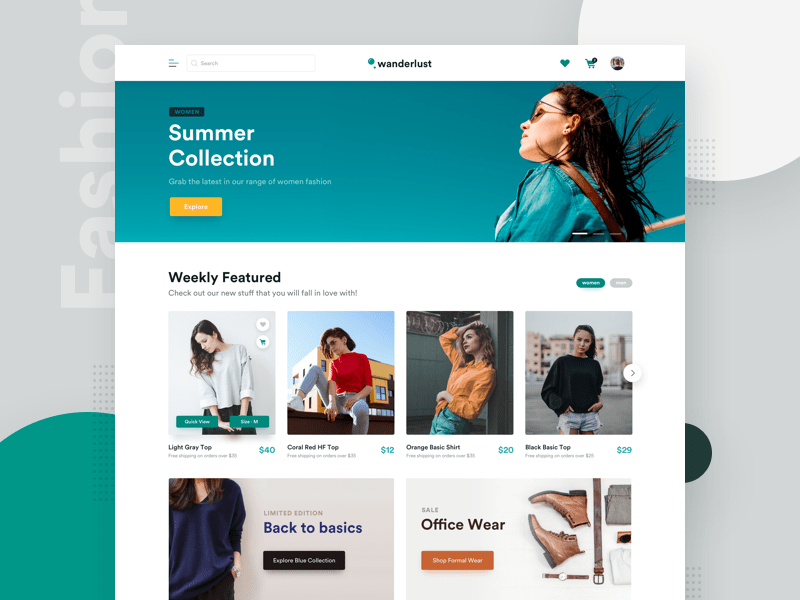
- Aimed mainly to adult (25 or older), with an average or high income (slighly more high income)
- Paper magazines:
- has various logo styles
- use script font for logo
- very attractive cover
- fine quality of pictures
- use san serif font – bold ad capital for the headline
- website:
- bring up new articles on top
- has icon on the top for: destination, interests, trip, event
- very attractive/dynamic design
- has an area for top 12 most popular articles
- separate articles for different topics
- not too many information in 1 page
- nice quality pictures and relevant articles
Other researches in sketchbook